
Bonjour,
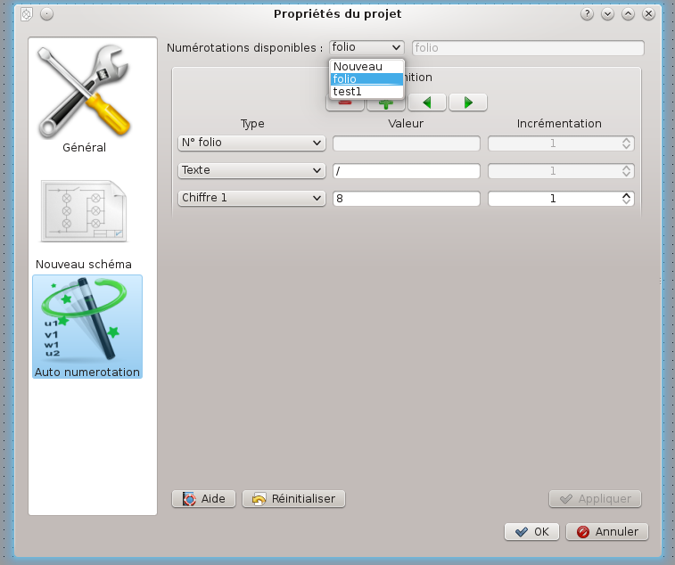
En premier il faut aller dans le menu projet -> propriétés du projet, puis sur auto numérotation.
ensuite on crée des règles de numérotation, puis il suffit de double cliquer sur le cartouche du folio en cours et choisir la règle qu'on souhaite ou sur l'icone bleu avec un i.
6,826 2014-08-12 07:32:05
Re: New auto numbering (28 replies, posted in News)
6,827 2014-08-12 04:44:08
Re: Soucis avec les renvois de folio (5 replies, posted in FR : Aide, suggestions, discussions, ...)
2)
Dans la config de Qet, section nouveau schéma, renvoi de folioLa config par défaut est : %f-%l%c
Sur 1 schéma déja existant, la modif de la config ne fonctionne pas sur le schéma, les renvois gardent en mémoire la config d'origine crée avec le schéma. Est-ce normal qu'on ne puisse pas changer la config des labels sur 1 schéma existants ?
les propriétés de qet serons pris en compte sur le prochain projet, en gros c'est des préférences globales, qui peuvent ensuite être surclassé par les propriétés du projet.
6,828 2014-08-12 04:25:05
Topic: Windows: automatic set styles (0 replies, posted in News)
Bonjour,
Un bug à été résolu, la couleur du bouton n'avait pas de changement âpres la sélection dans la palette de couleur, ni le focus sur la couleur du conducteur sélectionné, suivant les styles des OS: GTK, windowsxp, windowsvista, et surement Mac os X et pourtant fonctionnement parfait sous l'environnement KDE depuis des lustres!. 
Jusqu’à présent il était difficile de trancher sur quel style mettre par défaut pour les utilisateurs Windows. Car il reste des utilisateurs de Qet sous XP, ou pire .., et forcer un style windowsvista sur une machine en XP, ben ça passe pas, tiens donc ..
On se retrouve alors avec des gros carré bleu sur la barre de progression par exemple, etc ce qui donne pas envie.
Le style Vista est plus léché que le style XP, coins des boutons arrondis, relief, etc.
Donc dorénavant le code de Qet détectera la version de Windows et appliquera le style adéquat suivant la machine. rev:3267
Windows < XP -> style windows.
Windows = XP -> style windowsxp.
Windows ≥ vista -> style windowsvista.
Apres il est possible de surclasser en remettant -style windowsxp dans le "Lancer QET.bat" dans program files.
Enjoy!
6,829 2014-08-08 20:08:09
Re: New auto numbering (28 replies, posted in News)
Pour pas se retrouver avec un bouton carré sur un thème avec des boutons aux angles arrondis.
Modified: trunk/sources/ui/conductorpropertieswidget.cpp
===================================================================
--- trunk/sources/ui/conductorpropertieswidget.cpp      2014-08-08 14:23:47 UTC (rev 3258)
+++ trunk/sources/ui/conductorpropertieswidget.cpp      2014-08-08 16:26:03 UTC (rev 3259)
@@ -222,7 +222,7 @@
 void ConductorPropertiesWidget::setColorButton(const QColor &color) {
        QPalette palette;
        palette.setColor(QPalette::Button, color);
-       ui -> m_color_pb -> setStyleSheet(QString("background-color: %1").arg(color.name()));
+       ui -> m_color_pb -> setStyleSheet(QString("background-color: %1; min-height: 1.5em;  border-radius: 4px;").arg(color.name()));
 }


 /**
6,830 2014-08-08 15:25:04
Re: New auto numbering (28 replies, posted in News)
galexis wrote:
Je suis en train de réaliser quelques test, et je viens de comprendre pourquoi les numéros de fil se positionnent de façon bizarre.
Parfois il est au milieu du fil et parfois au bord. RAison:
- si je tire le fil du BP vers l'entrée API (de l'image jointe): le n° est au centre
- si je tire le fil de l'entrée API vers le BP: le numéro est à l'extrémité.
Bizarre comme comportement ..... Je l'avais observé auparavant, sans en comprendre la cause.
Tu remarqueras que si tu montes d'un cran sur la grille ton API ou baisses d'un cran tes BP les numéros de fils seront alignés ou pas.
6,831 2014-08-07 23:03:27
Re: New auto numbering (28 replies, posted in News)
Fixed!
J'ai fait du nettoyage dans mes VM, les mint, cinnamon, ubuntu, xp, w8 etc ont dégagées.
Donc à vous de tester sous gnome3...
Index: sources/ui/conductorpropertieswidget.cpp
===================================================================
--- sources/ui/conductorpropertieswidget.cpp (révision 3253)
+++ sources/ui/conductorpropertieswidget.cpp (copie de travail)
@@ -222,7 +222,7 @@
void ConductorPropertiesWidget::setColorButton(const QColor &color) {
QPalette palette;
palette.setColor(QPalette::Button, color);
- ui -> m_color_pb -> setPalette(palette);
+ ui -> m_color_pb -> setStyleSheet(QString("background-color: %1").arg(color.name()));
}
/**
6,832 2014-08-07 20:32:46
Re: New auto numbering (28 replies, posted in News)
Sur Windows le "style plastique" et le "style windows" ça fonctionne, mais plus avec les "style windowsxp", "style windowsvista"..
The documentation on QPalette states:
Warning: Some styles do not use the palette for all drawing, for instance, if they make use of native theme engines. This is the case for both the Windows XP, Windows Vista, and the Mac OS X styles.
6,833 2014-08-07 19:32:25
Re: New auto numbering (28 replies, posted in News)
galexis wrote:
Pour Qet en style plastique sous LinuxMint, le bouton prends bien la couleur, mais bon, c'est un peu moche...
Raison de plus de vous faire travailler sur les "style.css" 
6,834 2014-08-07 15:05:58
Re: New auto numbering (28 replies, posted in News)
A mon avis c'est un léger bug entre Qt et gnome, voir gtk.
ça l'est !!! pffouiii je viens de tester sous windows avec -style plastique au lieu de -style windowsxp et ça fonctionne .....
 le bouton change bien de couleur...
donc rien à voir avec un problème dans le code!!
Donc sur gnome comme dit plus haut pour les problemes avec le style.css lancer Qet avec l'option plastique, et user du css.
http://www.qtcentre.org/threads/19601-C … k-with-GTK
laurent@debian:~$ qelectrotech -style plastique
6,835 2014-08-06 22:43:00
Re: Auto-sauvegarde du projet en cours (2 replies, posted in FR : Aide, suggestions, discussions, ...)
Des plantages sur quel OS?
6,836 2014-08-06 20:58:26
Re: New auto numbering (28 replies, posted in News)
C'est depuis le dernier deb, ou c'etais avant?
Edit: paquets Windows seulement!
6,837 2014-08-06 20:50:58
Re: New auto numbering (28 replies, posted in News)
galexis wrote:
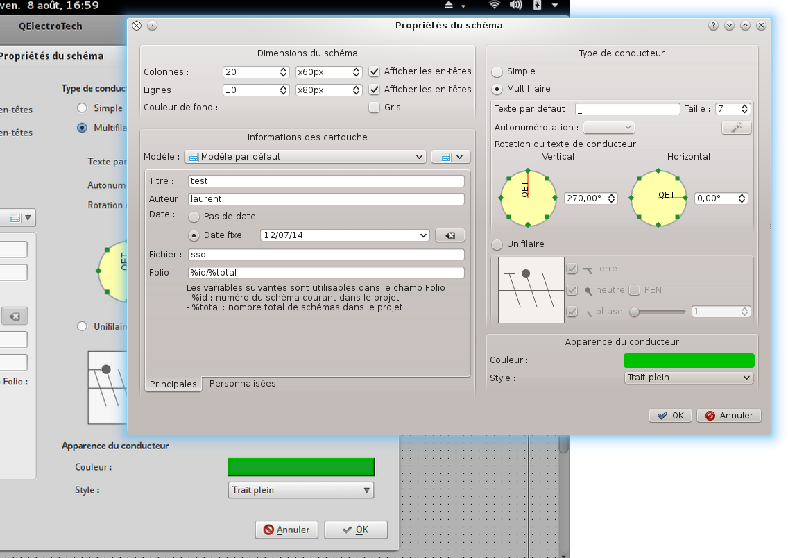
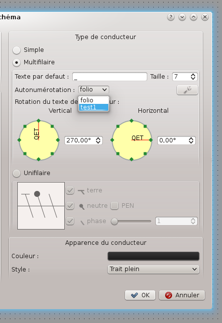
Les premiers essais fonctionnent bien, une fois que j'ai trouvé où il fallait choisit le format d'autonum : dans les propriétés du schéma concerné !
C'est du bon travail.
C'est pour ça que j'ai mit le Screenshots correspondant...
6,838 2014-08-06 20:49:21
Re: New auto numbering (28 replies, posted in News)
galexis wrote:
Autre chose sur les conducteurs: dans la boite de dialogue du conducteur, il y a une sorte de bouton pour choisir la couleur. Il pourrait être sympa de colorer ce bouton de la couleur active.
Il l'est! du moins chez moi, t'as mis des conducteurs en gris ? 
6,839 2014-08-06 19:30:44
Re: New auto numbering (28 replies, posted in News)
Je l'avais remarqué aussi dernièrement.
Beaucoup de code à été remanié dernièrement, possible que ça vienne de là.
6,840 2014-08-06 18:19:03
Re: New auto numbering (28 replies, posted in News)
Les paquets sont déjà uploadé :p
6,841 2014-08-06 17:06:29
Topic: New auto numbering (28 replies, posted in News)
Bonjour,
Quelques nouvelles fraîches..! 
Sur la numérotation auto jusqu’à présent il fallait créer une règle par folio, ce qui pouvait être très lourd sur un gros projet.
La numérotation auto peut maintenant gérer l'ensemble du projet :
Dans l’éditeur on crée des règles spécifiques du style:
commande
puissance
plc in
plc out
etc..
Ces règles pourrons ensuite être appelés sur n'importe lequel des folios du projet, il est aussi possible de passer d'une règle à l'autre
au sein d'un même folio.
Les règles sont importées dans le projet, pour l'instant il n'y a pas la possibilité de supprimer, renommer une règle ou d'exporter des règles d'un autre projet en GUI, mais facile d’éditer le .qet avec un éditeur de texte.
<conductors_autonums>
            <conductor_autonum title="folio">
                <part increase="1" type="folio" value=""/>
                <part increase="1" type="string" value="/"/>
                <part increase="1" type="unit" value="8"/>
            </conductor_autonum>
            <conductor_autonum title="test1">
                <part increase="1" type="string" value="test"/>
                <part increase="1" type="unit" value="3"/>
            </conductor_autonum>
        </conductors_autonums>
A partir de la révision 3229, la numérotation n’incrémente plus au travers de l’élément borne:
Un répertoire, ainsi qu'une borne de continuité à été ajouté.
Pour faire vos propres bornes, cet élément doit contenir le tag: link_type="terminal"
exemple
<definition width="20" version="0.3" hotspot_x="10" hotspot_y="10" height="20" type="element" ic="true" orientation="dyyy" link_type="terminal">
Enjoy!
6,842 2014-08-03 17:50:38
Re: Position de la érfernce croisé sur un esclave (6 replies, posted in FR : Aide, suggestions, discussions, ...)
galexis wrote:
HA oui, ok, il faut bouger le nom de l'élément pour bouger la réf croisée ...
Et dans l’éditeur de symbole tu peux choisir quel champ texte sera le label.
6,843 2014-08-03 17:07:14
Re: Position de la érfernce croisé sur un esclave (6 replies, posted in FR : Aide, suggestions, discussions, ...)
C'est comme les champs texte des symboles, déplaçables avec la touche "ctrl" sur le label.
6,844 2014-08-03 15:48:08
Re: Créer une bobine maître (22 replies, posted in FR : Aide, suggestions, discussions, ...)
dmesg | grep segfaultLa sortie risque de ne pas être très utile 
6,845 2014-08-03 15:44:28
Re: Position de la érfernce croisé sur un esclave (6 replies, posted in FR : Aide, suggestions, discussions, ...)
Bonjour,
Comme ça?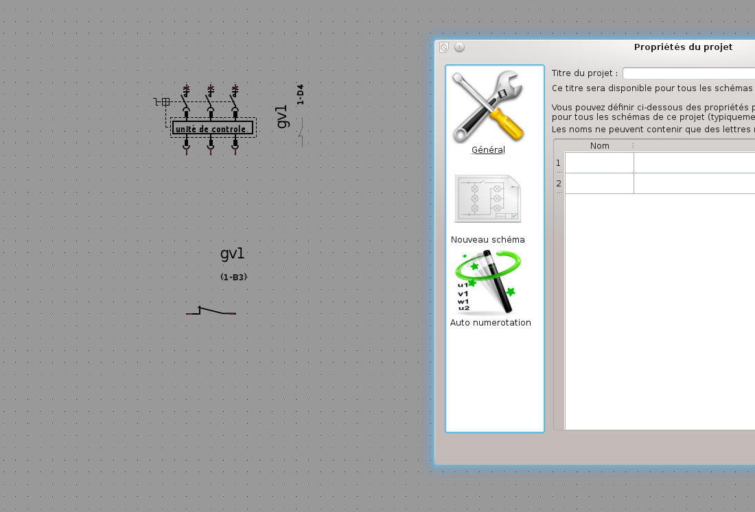
6,846 2014-07-26 23:16:14
Re: QElectroTech et Mac OS X Lion (38 replies, posted in FR : Aide, suggestions, discussions, ...)
6,847 2014-07-25 16:02:16
Re: repère fils amont/aval d'une borne de continuité (8 replies, posted in FR : Aide, suggestions, discussions, ...)
Voila, les builds sont encours d'upload
6,848 2014-07-24 16:59:29
Re: repère fils amont/aval d'une borne de continuité (8 replies, posted in FR : Aide, suggestions, discussions, ...)
Revision: 3230
Author: blacksun
Date: 2014-07-24 16:24:36 +0200 (Thu, 24 Jul 2014)
Log Message:
-----------
Element editor: manage terminal element
Du fait des problemes rencontrés par notre hébergeur, il n'y aura pas de paquets avant la semaine prochaine.
6,849 2014-07-24 05:45:05
Re: repère fils amont/aval d'une borne de continuité (8 replies, posted in FR : Aide, suggestions, discussions, ...)
Ploumploumtralala wrote:
Bonjour,
Lors de l'implantation d'une borne de continuité les fils amont et aval
doivent normalement avoir le même repère. Or sur Qelectrotech ces fils
ont un repère différent ce qui oblige à repasser sur toutes les bornes
pour modifier ces repères à la main. En soi ce n'est pas très gênant
pour les petits projets mais cela peux vite devenir un problème avec des
projets plus conséquents.
Y a t-il une option à configurer, ce comportement est il voulu par les développeurs ou bien est-ce un bug ?Encore merci pour votre travail
Cordialement
Bonjour,
A partir de la révision 3229, la numérotation n’incrémente plus au travers de l’élément borne:
Un répertoire, ainsi qu'une borne de continuité à été ajouté.
Pour faire vos propres bornes, cet élément doit contenir le tag: link_type="terminal"
exemple
<definition width="20" version="0.3" hotspot_x="10" hotspot_y="10" height="20" type="element" ic="true" orientation="dyyy" link_type="terminal">
6,850 2014-07-19 15:45:18
Re: MAC OS X, DXF convert (2 replies, posted in News)
Personnellement j'ai juste fait un après l'avoir compilé
sudo cp elmtviewer /usr/local/bin/Avec kde j'ai associé les fichiers *.elmt en premier de la liste sur le viewer ensuite kate et XML copy editor, quand je clic sur un elmt j'ai un aperçue avec le viewer, c'est tres rapide, ou au choix avec le clic droit de l'ouvrir avec kate, Qet, xml copy editor, etc.
Sinon tu le compiles
qmake-qt4
make

tu peux ensuite le lancer

./elmtviewer
et dans la fenêtre tu drag and drop un elmt, voila.
Apres le viewer c'est juste un mini Qet dont le code date un peu, il a été un peu rafraîchi dernièrement.